What Is the First Step to Data-Driven Roster Optimisation?
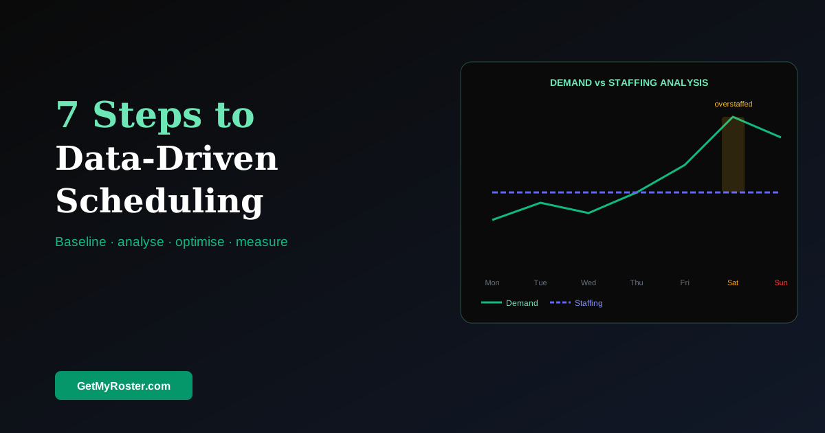
The first step is pulling together the three data sets you already have but probably haven't combined: your demand data (sales, covers, or transaction data by day and time), your wage cost data, and your roster records. Before any analysis is possible, you need to be able to see how many staff you were paying and when, laid over how much business you were doing and when. This overlap reveals the overstaffed and understaffed windows that are costing you money or service quality.
Most businesses roster by habit: the same shift template as last month, with adjustments for leave and new starters. This works well enough until margins tighten, headcount grows, or trading patterns shift — at which point a roster built on habit becomes a cost problem with no obvious fix. Data-driven scheduling replaces habit with analysis, making the cost of current rostering decisions visible and improvable. Here are the seven steps.
Step 1: Baseline Your Labour Cost Percentage
Calculate your labour cost percentage (LCP%) for the last 12 weeks: total wages divided by total revenue. This single number is the simplest measure of roster efficiency, and tracking it weekly creates the feedback loop that everything else depends on. Set a target LCP% before you start optimising and review weekly performance against it. For the cost-reduction specifics that complement this analysis, see our guide on 5 roster hacks for managers.
Step 2: Map Demand by Day and Hour
Extract transaction, sales, or covers data from your POS system, booking platform, or operational records for the last 8 weeks. Break it down by day of week and time period (hourly or in 2-hour blocks). You will see a demand heatmap that shows precisely when your business is busy and when it isn't — and it will almost certainly be more varied than your current roster structure assumes.
Step 3: Overlay Staffing Levels on the Demand Map
Add your rostered staff numbers (or labour hours) to the same time grid. Every cell where staffing is high but demand is low is a potential overstaffing cost. Every cell where staffing is low but demand is high is a potential service or compliance risk. This overlay is usually the first moment managers see systematic patterns they recognised instinctively but never quantified.
Step 4: Identify Your Top Three Mismatches
Rank the overstaffed and understaffed windows by magnitude and frequency. Your top three mismatches — the most consistent and largest gaps between demand and staffing — are your highest-leverage optimisation opportunities. Focus there first; don't attempt to optimise everything at once.
Step 5: Build a Revised Shift Template
Redesign the shift pattern to better match the demand curve. This might mean changing shift start and end times, adding a split shift window, introducing staggered starts, or creating a new part-time position for a specific peak window. Model the revised template's projected labour cost before implementing it.
Step 6: Measure the Change
Implement the revised template for four weeks and compare the LCP% and total labour hours against the previous four-week baseline. If the change improved efficiency, lock in the new template. If results are mixed, identify which specific windows improved and which didn't, and refine further.
Step 7: Build a Quarterly Review Cycle
Trading patterns change with seasons, business growth, and competitive shifts. A roster template optimised for March may not be optimal for December. Schedule a quarterly structural review — revisiting the shift template against current demand data — so optimisation is a habit, not a one-off exercise. For tools that support this ongoing review, see our overview of essential tools for team productivity.
Frequently Asked Questions
What data do I need to start optimising my roster?
Three data sets: historical demand data (sales, transactions, covers — whatever measures workload, by day and time period), labour cost data (wages paid by week), and roster records (who was scheduled when). Most businesses already have all three — the challenge is combining them for analysis.
What is the most common finding when businesses first analyse their roster data?
A mismatch between staffing levels and actual demand patterns. Almost every business that does this analysis discovers multiple time windows where they are systematically overstaffed — and often equivalent peak windows where they are understaffed. Both are costing the business: the former in unnecessary wages, the latter in service quality or missed revenue.
How do I measure roster efficiency?
The simplest metric is labour cost as a percentage of revenue (LCP%), tracked weekly. A secondary metric is scheduled vs. actual hours (to identify overtime leakage). Revenue per labour hour is a more advanced measure. Tracking any one of these consistently over time is more useful than sporadic deep analysis.
How often should I review my roster structure?
A structural review (revisiting the shift pattern template) should happen quarterly at minimum, or whenever trading patterns, staffing levels, or cost structures change significantly. A weekly LCP% check is a faster-feedback signal that tells you when a structural review is needed before the quarterly cycle arrives.
See Your Labour Cost in Real Time as You Build the Roster
GetMyRoster shows projected labour cost and hours against your targets as you schedule — so data-driven rostering happens as you work, not after the week is done.
Start Free Trial